As a summary, media technologies were evidently vital in the construction and research, planning and evaluation stages of our coursework process. On a wider scale, it made the process much more efficient and effective at attaining research, whilst more specifically to our music video and ancillary work, it allowed me to retain a quality which, I hope, is in conjunction with real media products.
Thursday, 5 May 2016

Monday, 25 April 2016
Evaluation Q2: How effective is the combination of your main product and ancillary texts?
Shown below is my response to evaluation question 2. Will and I conducted an interview-style vlog in order to answer the question; this was filmed using iMovie and then following this I added various video cuts from our music video and some still images showing my Digipak and Website design.
Besides my initial response, I would like to further add that the theme of friendship is recurred throughout my ancillary products and main product. The band is shown walking onto the stage in the music video and consequently they appear to be in a close-knit group, thus signifying the representation of friendsip which you would expect to see in an indie band. It is a theme that is certainly shown in other bands such as Imagine Dragons, AWOLNATION, Coldplay and Twin Atlantic as well as Walk off the Earth themselves. I have recurred this theme in my Digipak through the use of bright colours symbolising harmony and the inclusion of various photos of the band on the front cover and inside; these photos present the group again in a personal and close-knit group. Finally, the website, which similarly includes bright colours, also uses photos to present the group in this style, as well as including a section titled 'News' and 'About' which lets people explore the life of the band and understand how close-knit they are.
Friday, 22 April 2016
Tuesday, 19 April 2016
Final Website Design
Shown below is a link to our final website design alongside screenshots of it (although because for parts of the website you have to scroll down, the screenshots do not necessarily cover all of the web pages):
http://ollie966.wix.com/mysite


http://ollie966.wix.com/mysite
HOME PAGE:


NEWS PAGE:

TOUR PAGE:

ABOUT PAGE:

MEDIA PAGE:

STORE PAGE:

CONTACT PAGE:

Monday, 18 April 2016
Evaluation Q1 In what ways does your media product use, develop or challenge forms and conventions of real media products?
- Shown below is my response to this question. It is presented in the form of a Prezi with voiceovers on each slide presenting the information displayed with more added details. I have also included various YouTube links throughout the presentation which can be opened by clicking on them:
Thursday, 31 March 2016
Evaluation Q3 What have you learned from your audience feedback?
How my audience feedback was conducted?
To answer this question it is first important to reference what audience feedback I have gathered. Besides the original audience research I obtained at the beginning of the project which analysed what conventions we had to focus our music video around, I have carried out further research post-production. This research was focused more around whether our final product lived up to expectations and corresponded to conventions of other music videos in the same genre. To conduct this research I used Google Forms with a variety of open and closed questions which I then emailed to a collection of different aged recipients. Below is a link to the questionnaire:
And here are my results:


Although I have presented my findings in the charts shown above, I decided to make a short comic-strip type storyboard on bitstrips.com to also display some of the results in a more engaging and humorous manner. This is shown below:


What have I learned?
(Video made using Moviemaker and following this was uploaded to YouTube).
Thursday, 10 March 2016
Evolution of my Digipak and Final Design
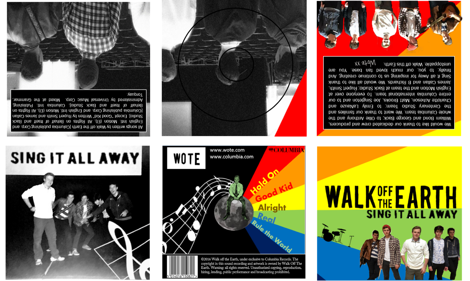
Shown to the left is my final Digipak design for Walk Off The Earth's 'Sing It All Away' album. The design does diverge slightly away from my original draft. For one, the original idea of having an earth on the front cover is not included on my final cover as I felt that it was not relevant enough to the band and was therefore fairly confusing; instead I decided to simply have the name of the band as well as the album name shown. On the interior of the Digipak, whilst I have largely kept the colour scheme similar to that which I initially anticipated, the actual design of the interior differs from my original draft- this includes the exclusion of the song names from the inside of the cover, as well as the replacement of the CD backing with a stretched out photo of the band across two panels of the Digipak. So, whilst my initial draft to offer much inspiration to my final example, the process of re-drafting and essentially 'playing around' with my design throughout the production process led to a alternative example to which I first off imagined, however I am undoubtedly happy with how it has concluded.
Shown below are a few screenshots showing the evolution of my Digipak throughout the production process. Notice the differences in text, typography and the placement of the record label throughout these examples:
Example 1)

Example 2)

Example 3)

Tuesday, 1 March 2016
Tuesday, 9 February 2016


Thursday, 28 January 2016
Beginning a Digipak design...
In Vlog 6 I showed my initial draft of a Digipak design for our music video. Since this I have spent some time working on a digital version of this draft. Shown below are a couple of these drafts. As you will see the first draft rigidly sticks to my initial design of having the 'Walk off the Earth' logo on the right hand side, however in the second I swayed away from this idea by incorporating a logo which was on both sides of the Earth. I also changed the pattern of colour in the background from the first to second draft:


The Earth in the centre of the draft I found online; following this I removed the background and applied an abstract look to it to generate a look that would suit a indie-style Digipak. The font for the band name I took from the Walk off the Earth website and then changed the colour and brightness of it.
The third draft shown below is my favourite so it is from this I will continue to work from:

Tuesday, 15 December 2015
Friday, 4 December 2015
Indie-Rock Website Research.
 The Walk Off the Earth website focuses on presenting
the group in a subdued and friendly manner through using almost water-colour
style effects and a picture of the group on the main page. In this picture the
band are represented as a close-knit friendship and thus it is a welcoming
image to present to consumers when they first go onto the website.
The Walk Off the Earth website focuses on presenting
the group in a subdued and friendly manner through using almost water-colour
style effects and a picture of the group on the main page. In this picture the
band are represented as a close-knit friendship and thus it is a welcoming
image to present to consumers when they first go onto the website.
There are links to Walk Off the Earth’s social networking
pages such as on Facebook and Instagram, and there are also links to places
where the music can be listened to, including Spotify, iTunes and Amazon Music.
Not only does this make the group more accessible, but it also undoubtedly aids
them in the distribution of their music.
The predominantly white background not only coordinates well
with the image, but it also makes the type font stand out more making the page
seem rigid and easy to follow (much unlike that of Gorillaz’s web page).
Included in the links to other parts of the website are: News, About, Tour,
Music, Videos, Promos, Contact, Store, Gear and Sign-up. It is here where you
can learn more about Walk Off the Earth and buy any related apparel as well as
tickets. There is also a section where you can scroll through pictures both on
and off stage. This allows a consumer to have a better understanding of the
personality of the band in a more holistic focus.

 The initial
contrast that strikes between Walk off the Earth and AWOLNATION upon visiting
their website, is that AWOLNATION orientate much more around darker colours and
focus more on advertising apparel and tour dates than Walk off the Earth do.
There is much more of an attribution to the rock genre, however a key
similarity between these two websites is that they both clearly present links
to their social networking sites (on AWOLNATION’s main page, the links are
shown on the top right corner).
The initial
contrast that strikes between Walk off the Earth and AWOLNATION upon visiting
their website, is that AWOLNATION orientate much more around darker colours and
focus more on advertising apparel and tour dates than Walk off the Earth do.
There is much more of an attribution to the rock genre, however a key
similarity between these two websites is that they both clearly present links
to their social networking sites (on AWOLNATION’s main page, the links are
shown on the top right corner).
The background image for AWOLNATION
shows six undomesticated horses running in the wild. Metaphorically this
signifies that AWOLNATION themselves are attributed to being free and careless;
hence the website successfully represents the band symbolically through the use
of its images, similar to that of Walk off the Earth.
ARTIC MONKEYS:
 Another similar genre band to Walk of the Earth is the Artic
Monkeys. Their website consists of solely black and white; this corresponds
with their logo. This black and white colour scheme means everything is very
clearly set out and creates a rigid structure. When you scroll down the web
page, the upper subtitles, as well as the logo, scroll down with it- this keeps
it easily accessible.
Another similar genre band to Walk of the Earth is the Artic
Monkeys. Their website consists of solely black and white; this corresponds
with their logo. This black and white colour scheme means everything is very
clearly set out and creates a rigid structure. When you scroll down the web
page, the upper subtitles, as well as the logo, scroll down with it- this keeps
it easily accessible.
Another comparison to draw out from these websites is the use
of colloquial language which suit their stereotypical representation. So, for
instance, where AWOLNATION and Walk off the Earth use the term ‘Tour’ to
reference any performances they may be doing, the Artic Monkeys have used
‘Gigs’. This demonstrates the more informal tone which flows throughout their
website and is perhaps done to appeal more to their target demographic of young
people rather than AWOLNATION whom aim to target more older students at a
university level and so, arguably, could be slightly more sophisticated.
 More
similar to the Artic Monkeys, The Killers use an embedded YouTube video as
their predominant focus when going to the homepage of the website. This video
takes up quite literally the whole of the screen when you first visit, and
further down the page visitors will be able to read about News and ‘Live Tweets’
that are happening. On top of this, regards this main video on the homepage,
they have developed a way of cycling through various images and videos, using
arrow keys to do so; this also occurs simultaneously upon visiting the
website.
More
similar to the Artic Monkeys, The Killers use an embedded YouTube video as
their predominant focus when going to the homepage of the website. This video
takes up quite literally the whole of the screen when you first visit, and
further down the page visitors will be able to read about News and ‘Live Tweets’
that are happening. On top of this, regards this main video on the homepage,
they have developed a way of cycling through various images and videos, using
arrow keys to do so; this also occurs simultaneously upon visiting the
website.
THE KILLERS:
The
Killers, described as an American indie-rock band, use a blue/purple sort of
colour scheme throughout their website. This forms both an attractive and
unique representation of the group, yet also entices more people to explore
their website through the appealing factor of this colour.
 More
similar to the Artic Monkeys, The Killers use an embedded YouTube video as
their predominant focus when going to the homepage of the website. This video
takes up quite literally the whole of the screen when you first visit, and
further down the page visitors will be able to read about News and ‘Live Tweets’
that are happening. On top of this, regards this main video on the homepage,
they have developed a way of cycling through various images and videos, using
arrow keys to do so; this also occurs simultaneously upon visiting the
website.
More
similar to the Artic Monkeys, The Killers use an embedded YouTube video as
their predominant focus when going to the homepage of the website. This video
takes up quite literally the whole of the screen when you first visit, and
further down the page visitors will be able to read about News and ‘Live Tweets’
that are happening. On top of this, regards this main video on the homepage,
they have developed a way of cycling through various images and videos, using
arrow keys to do so; this also occurs simultaneously upon visiting the
website.
Another
trait on the website to note, is that the band’s logo is the main focus of the
top border. It has been emphasised by using a black on white foreground and
background so that it stands out more. Similar to all of the other web pages,
it quite clearly key to a bands website to display links to their social media
accounts- this allows consumers to explore more about the artists and also
means they can develop a more personal connection with them.
In
summary, it is quite clear that to construct an effective website, there are
a few key traits and qualities to include. First off, the need for an appealing
welcome to the website- this is particularly relatable to Walk off the Earth’s
current webpage. Secondly, links to their social networking pages are key for
consumers- they have to be clearly visible and simple to use, and thirdly,
perhaps including videos, or if not, images, of the group(s) is an effective
way to develop a representation of the band that reaches the consumers when
they visit the web page. A final note would be the inclusion of colloquial
language that suits the personality of the group; this could be like ‘The Killers’
whom use ‘Sweet Talk’ to reference their forum chat.


Thursday, 3 December 2015
Monday, 23 November 2015
Friday, 20 November 2015
Walk Off The Earth Case Study
A montage-style video, with voice-over, developing on research I have done into Walk Off The Earth. It explores their genre, ways of distribution, social networking platforms they are present on, as well as awards they have won and the image the consumer receives of the band from the album covers they have made.
This video was made on iMovie and then exported to YouTube, followed by being embedded onto my blog.
Tuesday, 17 November 2015
Location scouting / Shot preparation
After doing some research into potential location scouting on Google Maps' Street View feature, we visited some sites which we thought would be appropriate for our music video:


Friday, 13 November 2015


Subscribe to:
Posts (Atom)