As a summary, media technologies were evidently vital in the construction and research, planning and evaluation stages of our coursework process. On a wider scale, it made the process much more efficient and effective at attaining research, whilst more specifically to our music video and ancillary work, it allowed me to retain a quality which, I hope, is in conjunction with real media products.
Ollie's Blog
Thursday, 5 May 2016
Monday, 25 April 2016
Evaluation Q2: How effective is the combination of your main product and ancillary texts?
Shown below is my response to evaluation question 2. Will and I conducted an interview-style vlog in order to answer the question; this was filmed using iMovie and then following this I added various video cuts from our music video and some still images showing my Digipak and Website design.
Besides my initial response, I would like to further add that the theme of friendship is recurred throughout my ancillary products and main product. The band is shown walking onto the stage in the music video and consequently they appear to be in a close-knit group, thus signifying the representation of friendsip which you would expect to see in an indie band. It is a theme that is certainly shown in other bands such as Imagine Dragons, AWOLNATION, Coldplay and Twin Atlantic as well as Walk off the Earth themselves. I have recurred this theme in my Digipak through the use of bright colours symbolising harmony and the inclusion of various photos of the band on the front cover and inside; these photos present the group again in a personal and close-knit group. Finally, the website, which similarly includes bright colours, also uses photos to present the group in this style, as well as including a section titled 'News' and 'About' which lets people explore the life of the band and understand how close-knit they are.
Friday, 22 April 2016
Tuesday, 19 April 2016
Final Website Design
Shown below is a link to our final website design alongside screenshots of it (although because for parts of the website you have to scroll down, the screenshots do not necessarily cover all of the web pages):
http://ollie966.wix.com/mysite
http://ollie966.wix.com/mysite
HOME PAGE:
NEWS PAGE:
TOUR PAGE:
ABOUT PAGE:
MEDIA PAGE:
STORE PAGE:
CONTACT PAGE:
Monday, 18 April 2016
Evaluation Q1 In what ways does your media product use, develop or challenge forms and conventions of real media products?
- Shown below is my response to this question. It is presented in the form of a Prezi with voiceovers on each slide presenting the information displayed with more added details. I have also included various YouTube links throughout the presentation which can be opened by clicking on them:
Thursday, 31 March 2016
Evaluation Q3 What have you learned from your audience feedback?
How my audience feedback was conducted?
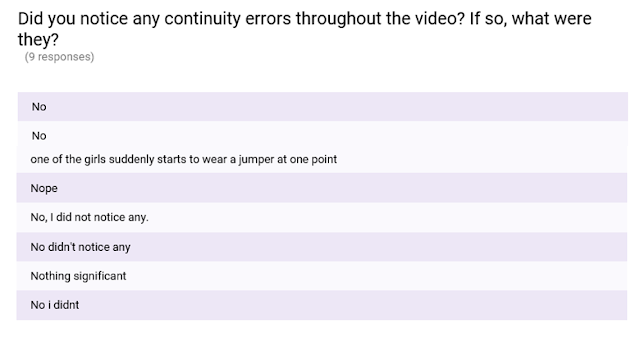
To answer this question it is first important to reference what audience feedback I have gathered. Besides the original audience research I obtained at the beginning of the project which analysed what conventions we had to focus our music video around, I have carried out further research post-production. This research was focused more around whether our final product lived up to expectations and corresponded to conventions of other music videos in the same genre. To conduct this research I used Google Forms with a variety of open and closed questions which I then emailed to a collection of different aged recipients. Below is a link to the questionnaire:
And here are my results:
Although I have presented my findings in the charts shown above, I decided to make a short comic-strip type storyboard on bitstrips.com to also display some of the results in a more engaging and humorous manner. This is shown below:

What have I learned?
(Video made using Moviemaker and following this was uploaded to YouTube).
Thursday, 10 March 2016
Evolution of my Digipak and Final Design
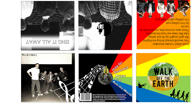
Shown to the left is my final Digipak design for Walk Off The Earth's 'Sing It All Away' album. The design does diverge slightly away from my original draft. For one, the original idea of having an earth on the front cover is not included on my final cover as I felt that it was not relevant enough to the band and was therefore fairly confusing; instead I decided to simply have the name of the band as well as the album name shown. On the interior of the Digipak, whilst I have largely kept the colour scheme similar to that which I initially anticipated, the actual design of the interior differs from my original draft- this includes the exclusion of the song names from the inside of the cover, as well as the replacement of the CD backing with a stretched out photo of the band across two panels of the Digipak. So, whilst my initial draft to offer much inspiration to my final example, the process of re-drafting and essentially 'playing around' with my design throughout the production process led to a alternative example to which I first off imagined, however I am undoubtedly happy with how it has concluded.
Shown below are a few screenshots showing the evolution of my Digipak throughout the production process. Notice the differences in text, typography and the placement of the record label throughout these examples:
Example 1)
Example 2)
Example 3)
Subscribe to:
Comments (Atom)


